Combobox
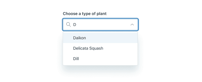
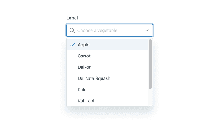
Combobox is an input plus a list box that appears beneath it. It searches and filters down options for the user.
This Combobox does not meet Web Content Accessibility Guidelines (WCAG) requirements. Use the new Combobox instead.
- To filter down a list of options
- To quickly find a known option
- As a search field
- To see a list of options in the dropdown without entering text in the input field, use Autocomplete
- To make more than one selection, use Multiselect instead
As the user types, options appear in the list box that match what the user is typing.
Customization
Size
Combobox can be displayed in either default or compact size.
Hidden Label
The label can be hidden.
Selection Logic
The combobox can be customized to include selection logic that highlights the first relevant result as the user types, allowing the user to press Enter to select the item. If this logic is not included, the user must manually select a result from the list.
Usage

Always place the magnifying glass icon at the start of the input when using the Combobox for search.

When using Combobox as a search input, automatically highlight the first suggestion in the list box and allow the user to press the Enter key to submit the search.

Use an Autocomplete component to create a dropdown that shows a list of options without needing to enter text in the input field.
Configuration
- Name8.76.4•View source•View on npm
- Installnpm install @zendeskgarden/react-dropdowns
- Depsnpm install react react-dom styled-components @zendeskgarden/react-theming
- Importimport { Combobox, Dropdown, Field, Hint, Label, Menu, Item } from '@zendeskgarden/react-dropdowns'
API
The Combobox component follows this structure:
<Dropdown><Field><Label /><Hint /><Combobox /></Field><Menu><Item /><Item />{/* etc. */}</Menu></Dropdown>
Combobox
Extends HTMLAttributes<HTMLDivElement>
Nest a Combobox within a Field component.
| Prop name | Type | Default | Description |
|---|---|---|---|
disabled | boolean | – | Indicates that the element is not interactive |
end | any | – | Defines the icon rendered in the end position |
focusInset | boolean | – | Applies inset box-shadow styling on focus |
inputRef | Ref<HTMLInputElement> | – | Provides ref access to the underlying input element |
isBare | boolean | – | Removes borders and padding |
isCompact | boolean | – | Applies compact styling |
placeholder | string | – | Defines text that appears in the element when no items are selected |
start | any | – | Defines the icon rendered before the element's content |
validation | 'success' | 'warning' | 'error' | – | Applies validation state styling |
Dropdown
The Dropdown component provides state and accessibility to its consumers while enabling customization. It uses PopperJS for positioning.
Dropdown State: The Downshift library handles
keyboard and accessibility logic. Provide other customizations directly to Downshift via
downshiftProps. See the stateReducer pattern
for a common customization strategy example.
Server Side Rendering: Server side rendering might require specific Downshift settings. The dropdowns package re-exports Downshift’s resetIdCounter utility, resetting the internal counter which is used to generate unique IDs for Downshift.
| Prop name | Type | Default | Description |
|---|---|---|---|
downshiftProps | Record<string, any> | – | Passes customization props to the Downshift component |
highlightedIndex | number | – | Highlights an element at a selected index |
inputValue | string | – | Sets the value of the input element |
isOpen | boolean | – | Opens the dropdown |
onInputValueChange | – | Handles input value change Parameters inputValue Value of the input elementstateAndHelpers Downshift state and helpers | |
onSelect | – | Handles item selection Parameters selectedItem The selected itemstateAndHelpers Downshift state and helpers | |
onStateChange | – | Handles state change Parameters options Downshift internal state changesstateAndHelpers Downshift state and helpers | |
selectedItem | any | – | Identifies the currently selected item |
selectedItems | any[] | – | Identifies the currently selected items |
Field
Extends HTMLAttributes<HTMLDivElement>
A Field provides accessibility attributes to the child Combobox field by associating it with the corresponding Label and Hint.
Hint
Extends HTMLAttributes<HTMLDivElement>
Nest a Hint within a Field component.
Item
Extends LiHTMLAttributes<HTMLLIElement>
Nest an Item within a Menu component. It requires a value prop, which it provides to
the onSelect callback.
| Prop name | Type | Default | Description |
|---|---|---|---|
disabled | boolean | – | Indicates that the element is not interactive |
isDanger | boolean | – | Applies danger styling |
value | any | – | Sets the value that is returned upon selection |
Label
Extends LabelHTMLAttributes<HTMLLabelElement>
Nest a Label within a Field component.
| Prop name | Type | Default | Description |
|---|---|---|---|
hidden | boolean | – | Hides the label visually without hiding it from screen readers |
isRegular | boolean | – | Applies regular (non-bold) font weight |
Menu
Extends HTMLAttributes<HTMLUListElement>
A Menu manages placement, positioning and layout of the child Item components.
| Prop name | Type | Default | Description |
|---|---|---|---|
appendToNode | HTMLElement | – | Appends the menu to the element provided |
eventsEnabled | boolean | true | Allows the menu to reposition during browser resize events |
hasArrow | boolean | – | Attaches an arrow that points towards the menu trigger |
isAnimated | boolean | true | Animates the menu |
isCompact | boolean | – | Applies compact styling |
maxHeight | string | '400px' | Sets the max-height of the menu |
placement | 'start' | 'end' | 'auto' | 'top' | 'bottom' | 'top-start' | 'top-end' | 'bottom-start' | 'bottom-end' | 'end-top' | 'end-bottom' | 'start-top' | 'start-bottom' | 'bottom-start' | Adjusts the placement of the menu |
popperModifiers | Modifiers | – | Passes configuration options to the Popper instance |
zIndex | number | 1000 | Sets the z-index of the menu |