Autocomplete
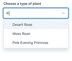
Autocomplete is an input field that filters results as users type. This helps users find something quickly in a large list of options.
Autocomplete does not meet Web Content Accessibility Guidelines (WCAG) requirements. Use Combobox instead.
- To filter down a large list of options
- To quickly find a known option
- To make more than one selection, use Multiselect instead
How to use it
Default
The typical usage of an Autocomplete component.
Hidden label
Autocomplete labels can be hidden.
Media
Media elements add even more context to an Autocomplete.
Size
Autocomplete comes in two sizes: default and compact.
How to use it well
Use Autocomplete to narrow down options

Autocomplete is useful for lists that are too long to read in full (for example, company employees) or that accumulate items over time (for example, an inventory).
Configuration
- Name8.76.4•View source•View on npm
- Installnpm install @zendeskgarden/react-dropdowns
- Depsnpm install react react-dom styled-components @zendeskgarden/react-theming
- Importimport { Autocomplete, Dropdown, Field, Hint, Label, Menu, Item } from '@zendeskgarden/react-dropdowns'
API
The Autocomplete component follows this structure:
<Dropdown><Field><Label /><Hint /><Autocomplete /></Field><Menu><Item /><Item />{/* etc. */}</Menu></Dropdown>
Implementation notes
- The dropdowns package does not have filtering logic. The simplest way to include filtering is to control
the
inputValueandonInputValueChangeprops, and conditionally render Item components as necessary. - Use the
onInputValueChangeprop instead of or in combination withonStateChangefor more accurate IME (Input Method Editor) support - There is a known issue with
Google Translate. As a workaround, wrap any conditionally rendered text node with a
spanelement.
Autocomplete
Extends HTMLAttributes<HTMLDivElement>
The Autocomplete component applies state and accessibility attributes to its children. Nest it within a Field component.
| Prop name | Type | Default | Description |
|---|---|---|---|
disabled | boolean | – | Indicates that the element is not interactive |
focusInset | boolean | – | Applies inset box-shadow styling on focus |
inputRef | Ref<HTMLInputElement> | – | Provides ref access to the underlying input element |
isBare | boolean | – | Removes borders and padding |
isCompact | boolean | – | Applies compact styling |
start | any | – | Defines the icon rendered before the element's content |
validation | 'success' | 'warning' | 'error' | – | Applies validation state styling |
Dropdown
The Dropdown component provides state and accessibility to its consumers while enabling customization. It uses PopperJS for positioning.
Dropdown State: The Downshift library handles
keyboard and accessibility logic. Provide other customizations directly to Downshift via
downshiftProps. See the stateReducer pattern
for a common customization strategy example.
Server Side Rendering: Server side rendering might require specific Downshift settings. The dropdowns package re-exports Downshift’s resetIdCounter utility, resetting the internal counter which is used to generate unique IDs for Downshift.
| Prop name | Type | Default | Description |
|---|---|---|---|
downshiftProps | Record<string, any> | – | Passes customization props to the Downshift component |
highlightedIndex | number | – | Highlights an element at a selected index |
inputValue | string | – | Sets the value of the input element |
isOpen | boolean | – | Opens the dropdown |
onInputValueChange | – | Handles input value change Parameters inputValue Value of the input elementstateAndHelpers Downshift state and helpers | |
onSelect | – | Handles item selection Parameters selectedItem The selected itemstateAndHelpers Downshift state and helpers | |
onStateChange | – | Handles state change Parameters options Downshift internal state changesstateAndHelpers Downshift state and helpers | |
selectedItem | any | – | Identifies the currently selected item |
selectedItems | any[] | – | Identifies the currently selected items |
Field
Extends HTMLAttributes<HTMLDivElement>
A Field provides accessibility attributes to the child Autocomplete field by associating it with the corresponding Label and Hint.
Hint
Extends HTMLAttributes<HTMLDivElement>
Nest a Hint within a Field component.
Item
Extends LiHTMLAttributes<HTMLLIElement>
Nest an Item within a Menu component. It requires a value prop, which is provided to
the onSelect callback.
| Prop name | Type | Default | Description |
|---|---|---|---|
disabled | boolean | – | Indicates that the element is not interactive |
isDanger | boolean | – | Applies danger styling |
value | any | – | Sets the value that is returned upon selection |
Label
Extends LabelHTMLAttributes<HTMLLabelElement>
Nest a Label within a Field component.
| Prop name | Type | Default | Description |
|---|---|---|---|
hidden | boolean | – | Hides the label visually without hiding it from screen readers |
isRegular | boolean | – | Applies regular (non-bold) font weight |
Menu
Extends HTMLAttributes<HTMLUListElement>
A Menu manages placement, positioning and layout of the child Item components.
| Prop name | Type | Default | Description |
|---|---|---|---|
appendToNode | HTMLElement | – | Appends the menu to the element provided |
eventsEnabled | boolean | true | Allows the menu to reposition during browser resize events |
hasArrow | boolean | – | Attaches an arrow that points towards the menu trigger |
isAnimated | boolean | true | Animates the menu |
isCompact | boolean | – | Applies compact styling |
maxHeight | string | '400px' | Sets the max-height of the menu |
placement | 'start' | 'end' | 'auto' | 'top' | 'bottom' | 'top-start' | 'top-end' | 'bottom-start' | 'bottom-end' | 'end-top' | 'end-bottom' | 'start-top' | 'start-bottom' | 'bottom-start' | Adjusts the placement of the menu |
popperModifiers | Modifiers | – | Passes configuration options to the Popper instance |
zIndex | number | 1000 | Sets the z-index of the menu |